Ta-Da! is a new brand for the supermarket chain, which offers affordable household goods. We were faced with the task of breathing a new life into the brand, turning local stores into a modern network, bringing the brand to new regional markets. We had to create people’s household goods store, which is not inferior to European equivalents.


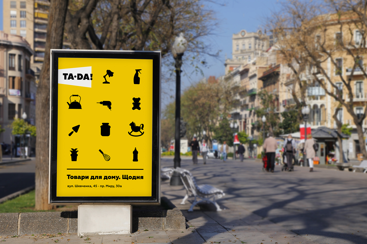
We developed a strategy whose primary goals were to increase the number of stores and regional expansion. Then we changed the name to a more imposing name Ta-Da! and created a new brand identity, whose central symbol became a stylized megaphone, from which sounds: "The goods for the house. Daily"


To ensure that a buyer can promptly find the price and name of an item, price tags contain an optimal amount of information. Yellow color helps to easily locate the item on shelves.


We developed a laconic design of product packaging for the goods selling under store own trade mark. It stands out favorably on shelves, although it uses only two colors, which reduces the costs of its production.


A huge area of shops is one of the main advantages of the Ta-Da! network, in which, literally, you can place a dinosaur or hippopotamus. That’s why for an advertising campaign, we created characters, who bite and tread down prices, making them available in consumer’s perception. The size of the characters hints at the size of the store and profitability of its offers.


Emotional characters (hippopotamus and dinosaur) are designed to evoke a smile and make communication with customers easy and fun


